OLD WORLD CLASSICS.
DONE RIGHT.
A short, practical guide to keeping our look and voice consistent — from the wordmark on a window decal to a receipt at the bottom of a takeout bag. If you’re putting our name on something, start here.
How we sound
Best Italian sounds like a confident family restaurant that doesn’t need to oversell. Plain English, full sentences, sensory nouns — read it out loud and it should sound like the owner talking to a regular.
Family table, not corporate
We, us, our — never an anonymous brand voice. We address the customer like a regular who just walked in.
Full sentences, no ad-speak
Specific, concrete nouns — golden garlic knots, creamy pastas, homemade strawberry cheesecake. No “artisanal,” “curated,” or “elevated.”
Earn it, don’t claim it
“We know it’s our hearty, comforting flavors that keep our customers coming back.” Stated as fact, not a brag.
The wink lives in parentheticals
Tucked-away asides do the joking — (just look at the size of our calzones) — without breaking the steady tone.
- Hand-stretched dough and fresh basil.
- Made with love in town, since 1962. Come hungry.
- From Italy, with love.
- Artisanal, curated culinary experiences.
- Elevating the pasta game, one bowl at a time.
- Authentic Italian-inspired flavors.
Casing. Headlines are ALL CAPS in the letterpress display face, tracked open ~2–3%. Sub-heads are sentence-case italic serif. Title Case is not used.
Punctuation. Oxford comma, always. Em-dashes welcome — they’re conversational. Periods at the end of taglines. From Italy, with love. — not “with love” floating.
No emoji, anywhere. The fork dingbat and monogram stamp do all the decorative work. Exclamation points are saved for things that are genuinely loud.
Numbers. Written out under ten in body copy (four cheeses), digits in menus and prices ($14, 12”).
The wordmark
Our primary mark is the hand-lettered “Best Italian” wordmark with the fork-dingbat tagline beneath. It’s the most important asset we have. Use it generously, but never edit it — and never retype it.
Two-color, green wordmark over ink tagline. This is the default. Use on cream, paper, or any neutral surface with enough contrast against both inks.
Maintain clear space equal to the cap-height of the tagline (×) on all sides. No type, photography, or competing marks may enter this zone.
Choose the variant with the most contrast against your background. Single-color black is reserved for newsprint and one-color print runs.
Ink on paper
Our green palette is pulled straight from the wordmark. Green carries the brand throughout, bringing warmth, familiarity, and a timeless Italian feel.
Polenta
Cypress
Basil
A rough target for any layout. Cypress sets the mood, basil carries the brand, cream gives it breathing room, and ink earns its keep as accent only.
Four faces
A script, a letterpress serif, a body serif, and a condensed sans. The script is the logo. Letterhack does all the headlines. Lora is for reading. Oswald is for menu-style labels and buttons.
Best Italian
FROM ITALY,
WITH LOVE.
Hearty, comforting flavors that keep our customers coming back year after year.
Order Online · Find Us · Menu
The small stuff
This is an illustration-rich brand system rooted in warmth, personality, and old-school Italian charm. Hand-drawn graphics and expressive small details do much of the visual storytelling.






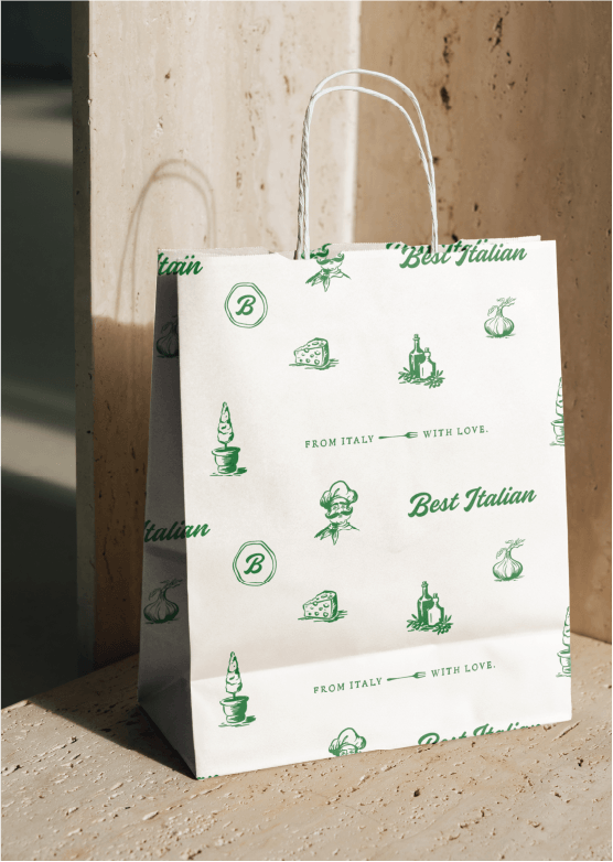
A small library of hand-drawn spot illustrations rendered in single-color. The illustrations stand in place of a hero photo, not on top of one. Occasionally these illustrations are tiled or arranged into repeat patterns for endpapers, packaging interiors, and gift-card backs — see Patterns below.

The brand’s signature section break and sign-off: the tagline lockup — FROM ITALY — WITH LOVE. — with its custom fork illustration. Use it once per long page or piece of collateral; it loses its meaning if it appears every other section. Always the artwork, never retypeset.
AT THE TABLE
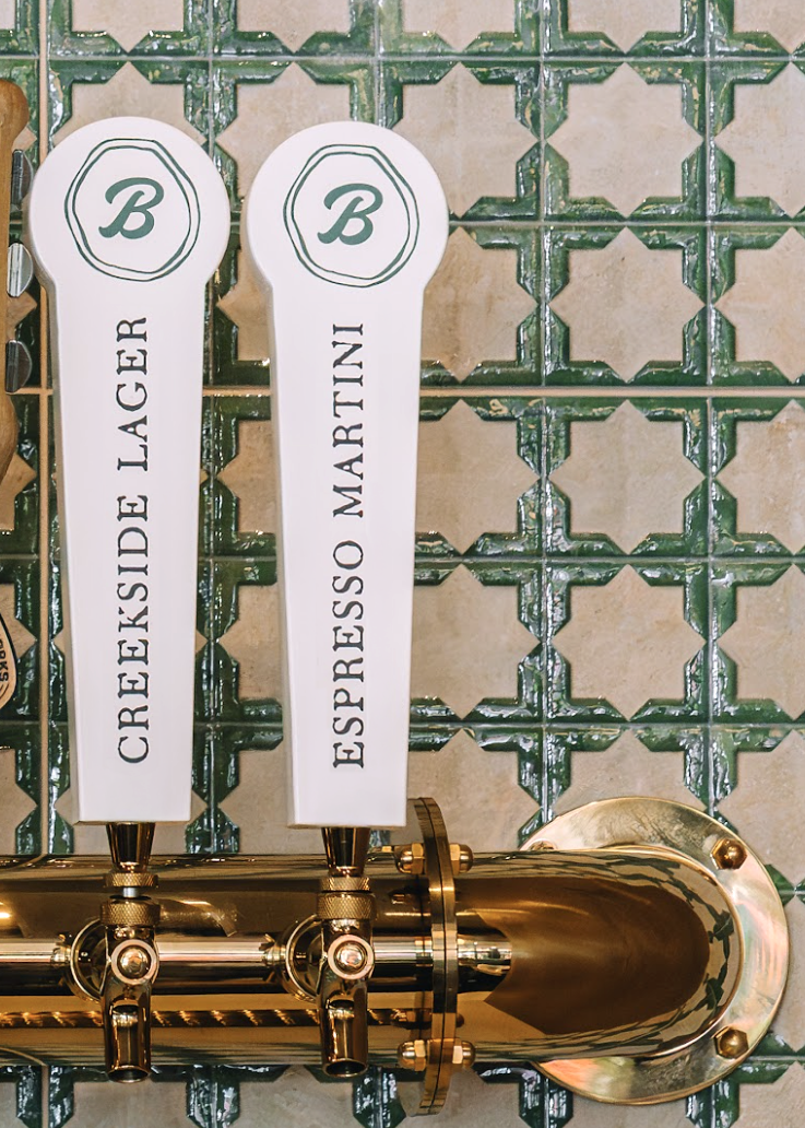
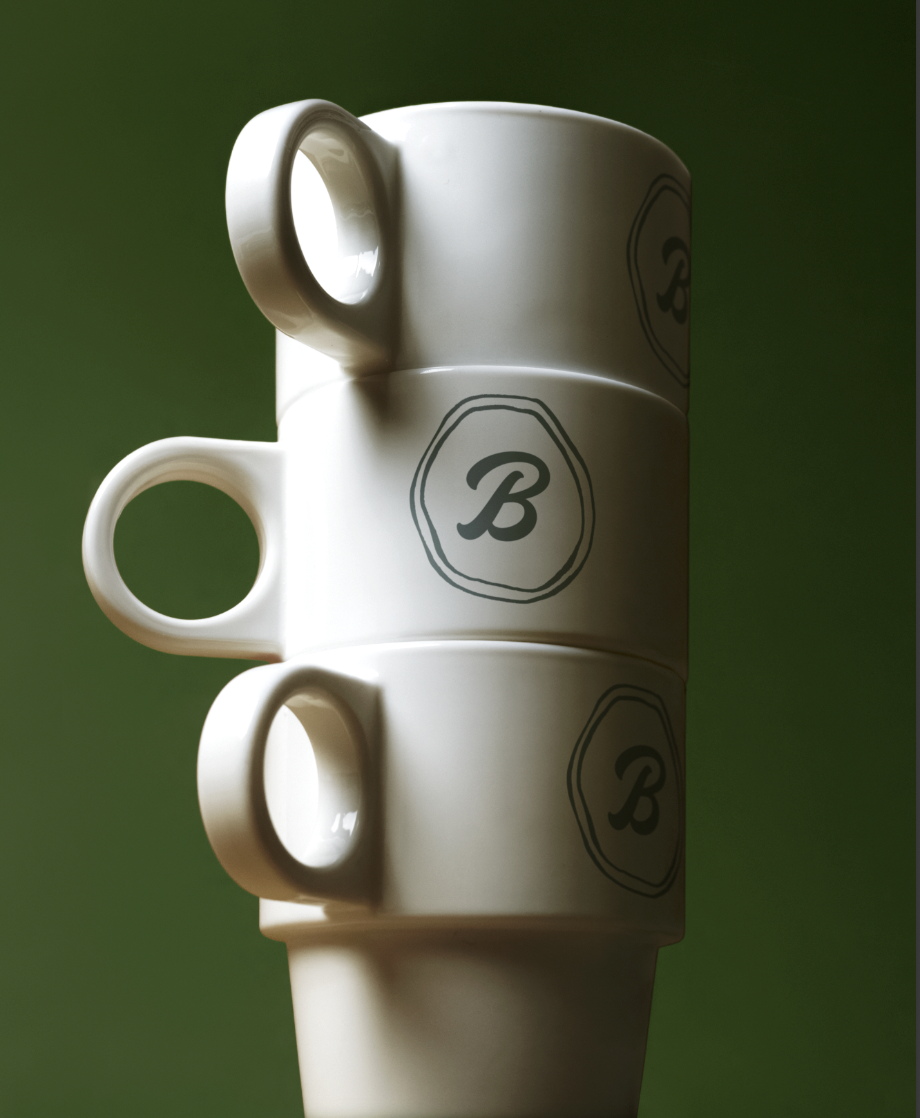
The brand in use — typography on a tap handle, monogram on porcelain, and the illustration library tiled across a takeout bag. A quick reference for how the parts come together in service.